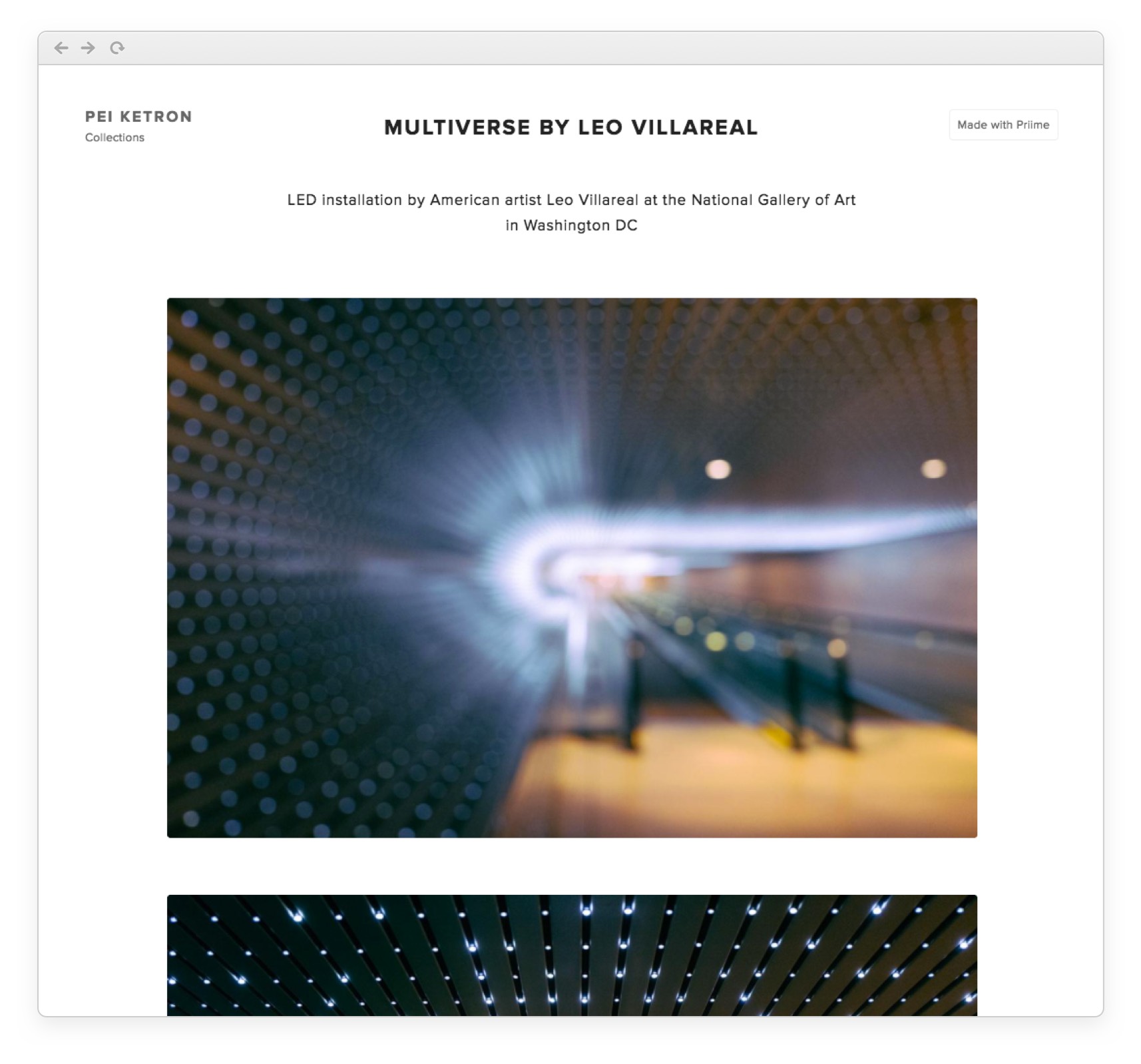
We've released a new update today for Priime Collections that displays your collections optimized by the number of photos in your collection as well as your browser size.
For collections with less than 9 photos, we use full resolution photos in full width that always fits into your browser screen. We display these collections in full width instead of a grid to fill the browser window with beautiful photography work. Especially for vertical photos, we crop your photo according to your browser to make sure that your full photo is shown and not cut off.

Check out Style Author Pei Ketron's latest collection, "Multiverse by Leo Villareal", to see an example of the collection layout with less than 9 photos.

For collections with 9 or more photos or more, we utilize a grid layout that optimizes photo layout based on the photos' sizes, giving you a clean organized look to your collection.
Check out Adrián Cano Franco's "The Unexpected Journey" collection to see what the grid layout looks like with 9 photos or more.

You can create your own Priime Collections on the Priime iOS app.
